ERA Coalition Woman Corp
Identity Design
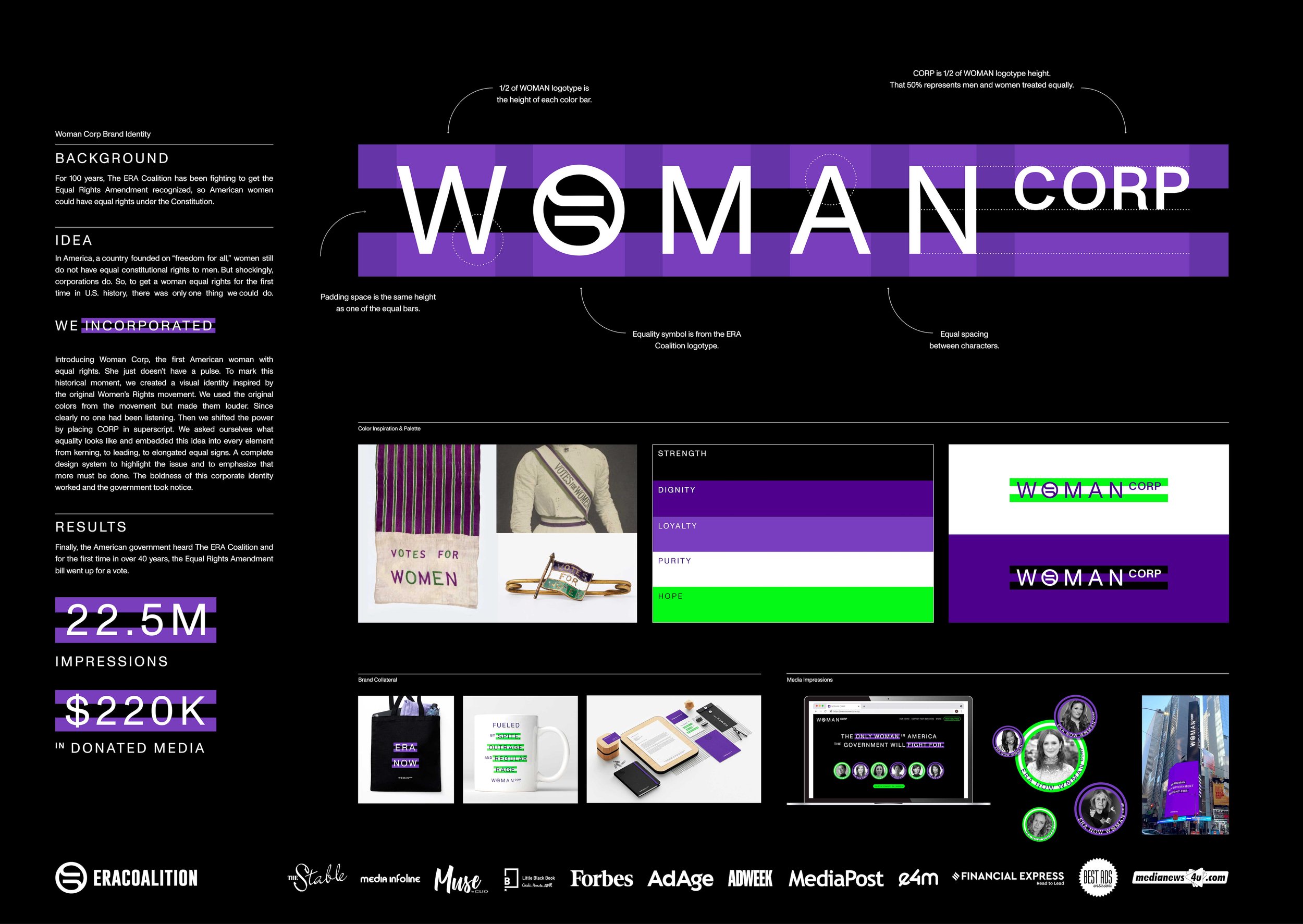
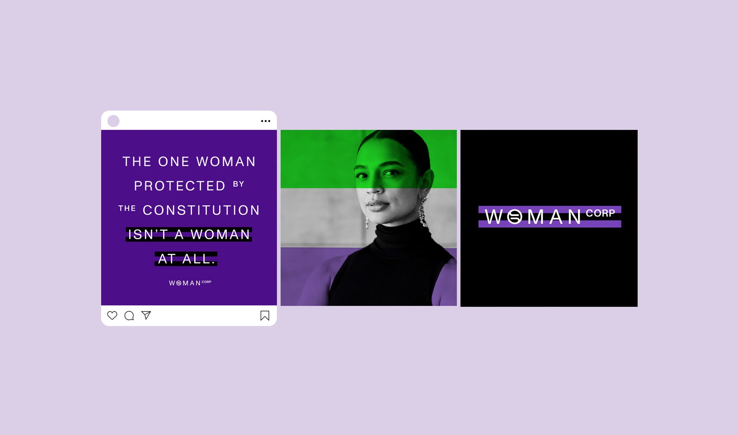
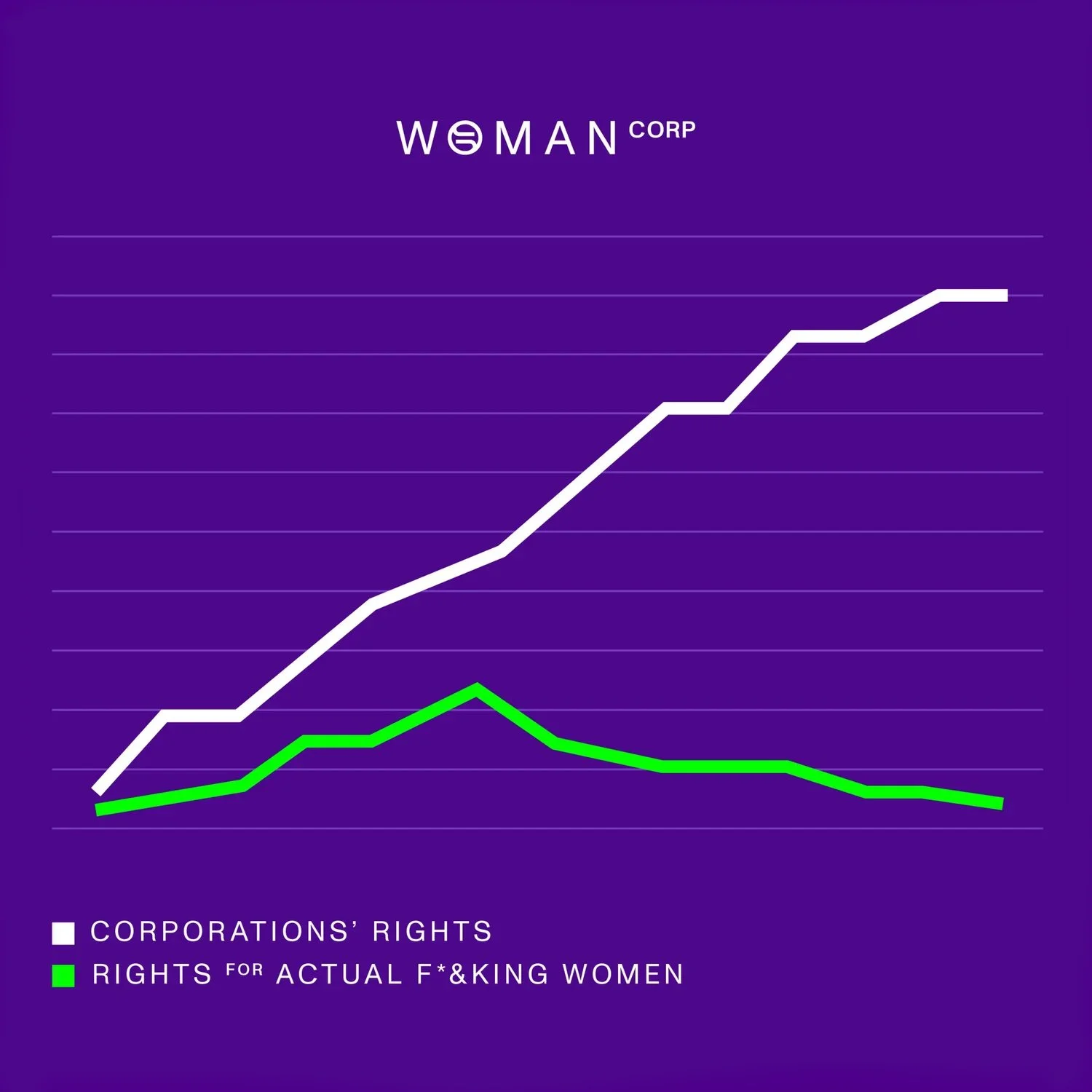
Infuriatingly, corporations have more rights in America than women. So, how could we do what the government has failed to for hundreds of years and grant a woman some basic rights? We incorporated.
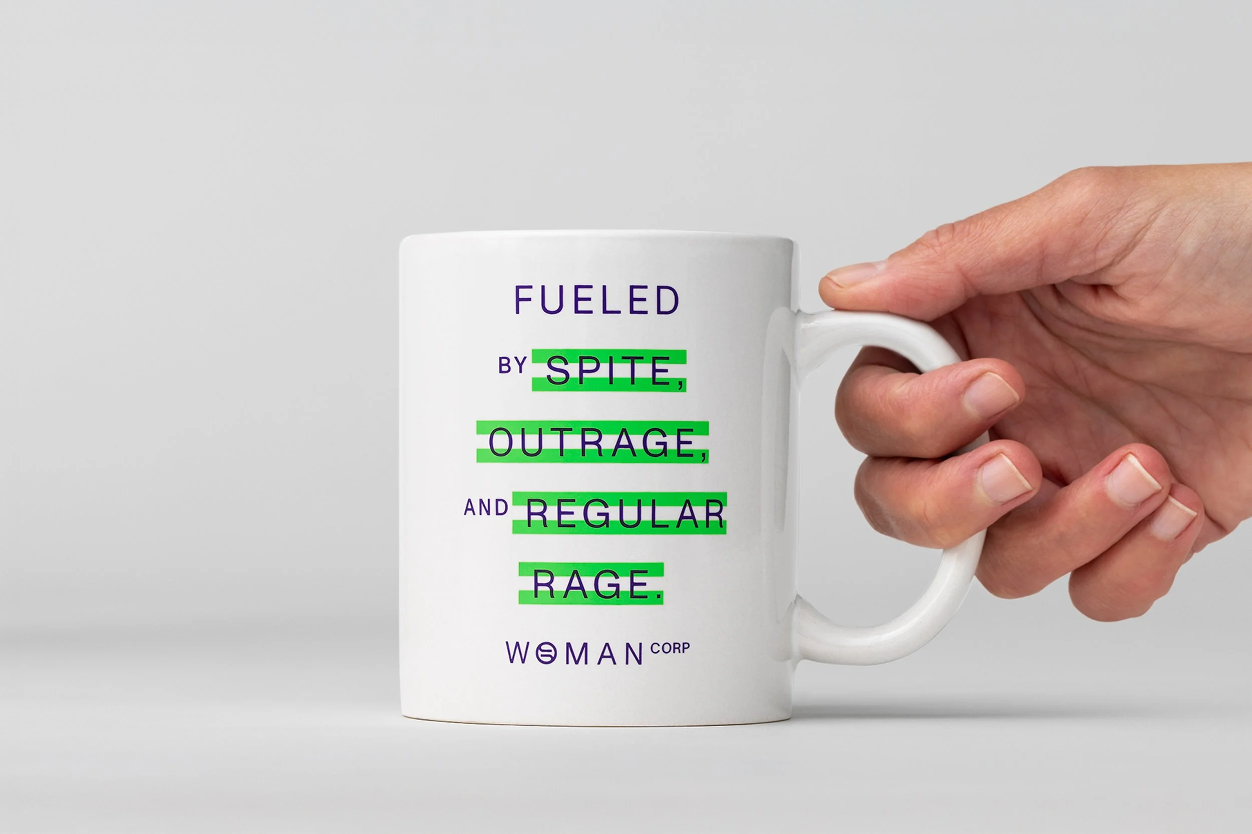
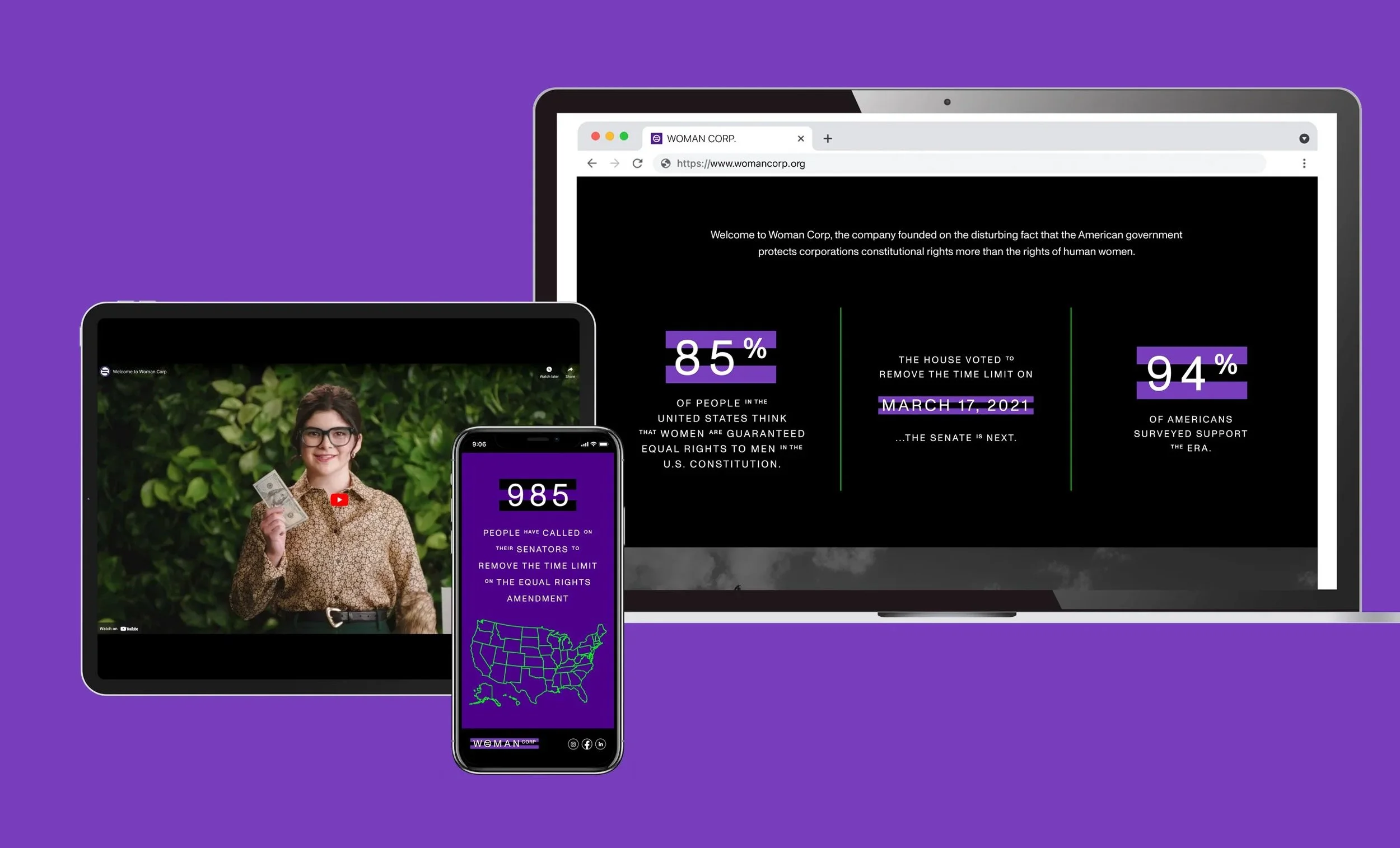
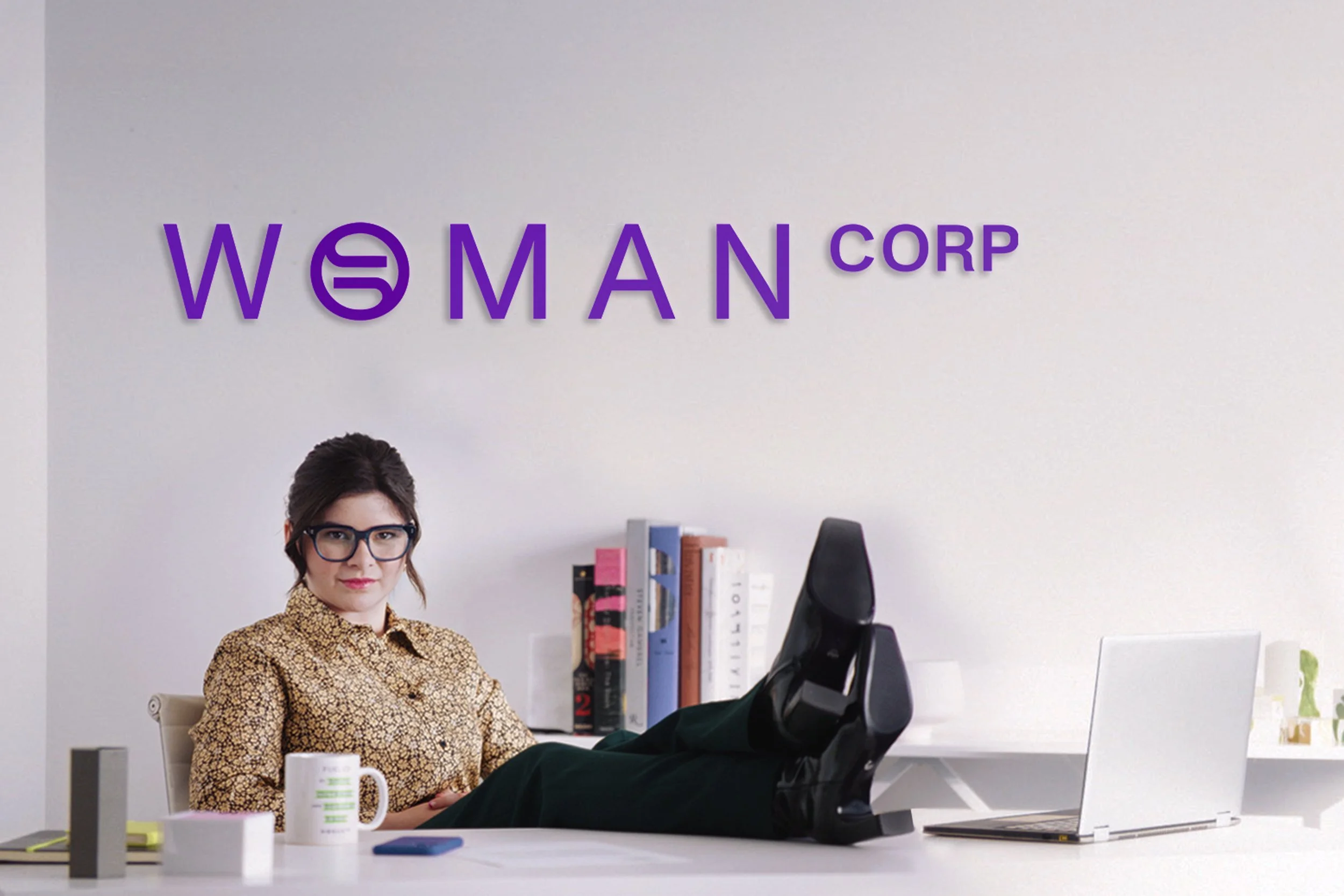
Creating Woman Corp, the first woman who had equal constitutional rights, she just didn't have a pulse. After filing our paperwork, we did everything other corporations do, from hiring a CEO, getting a board of directors, making swag, and releasing a corporate video. On social people connected with Woman Corp on LinkedIn and on TikTok our message was amplified by those who shared in our rage. Ultimately, it caught the attention of the American government, and the ERA bill was reintroduced to Congress for the first time in over a decade.
The Design Brief: What does Equality look like?
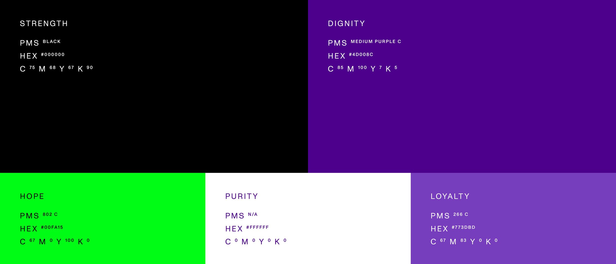
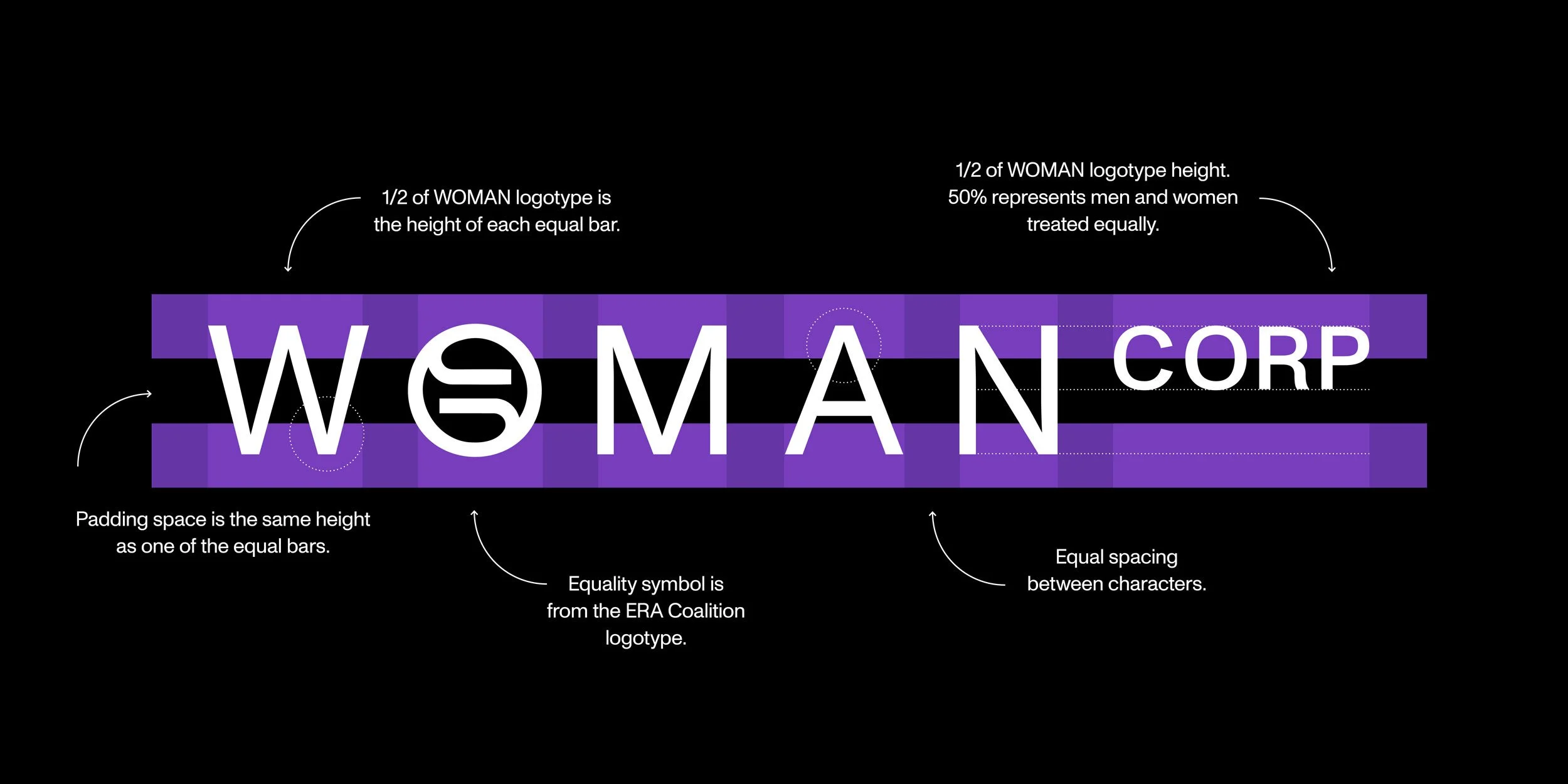
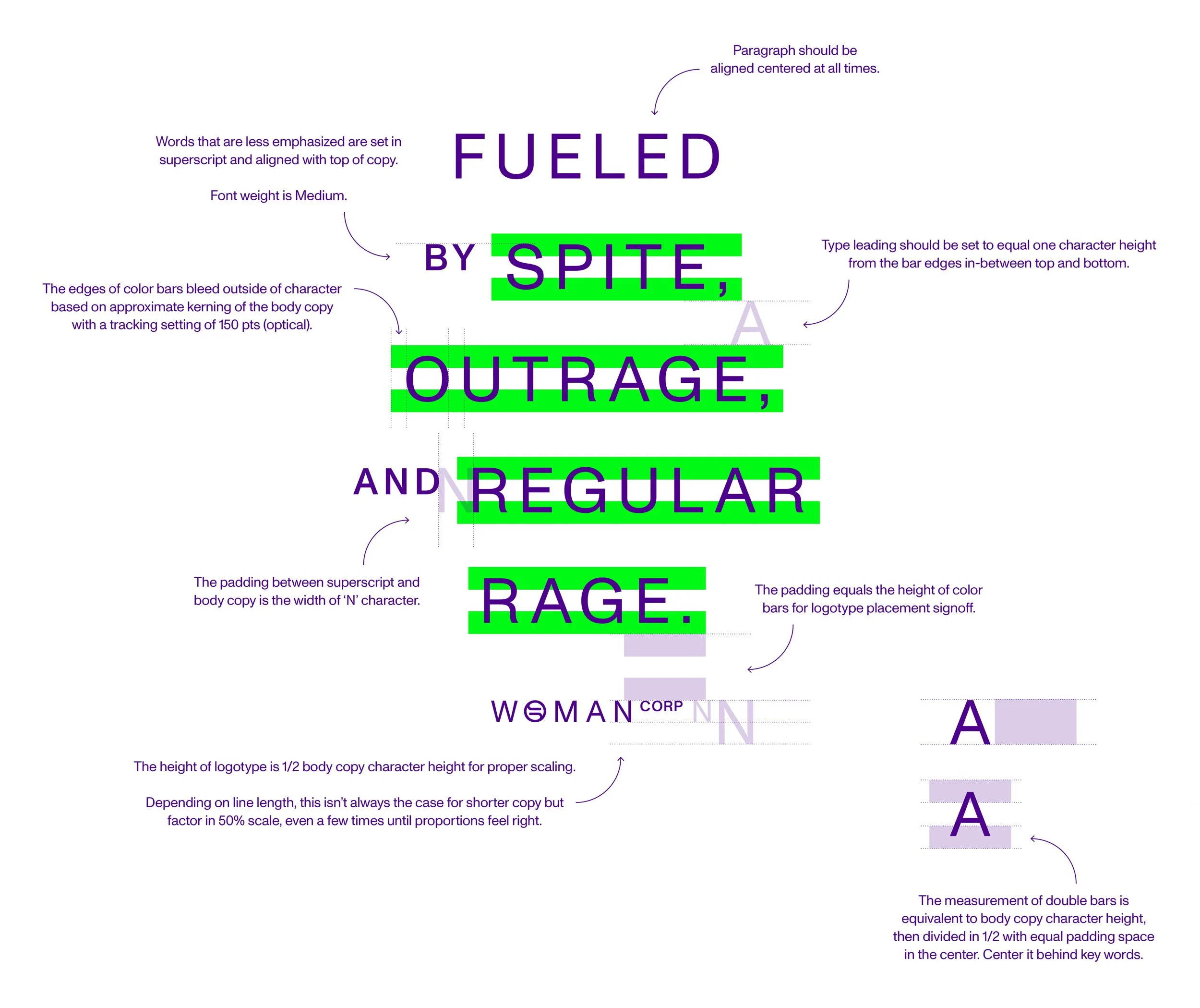
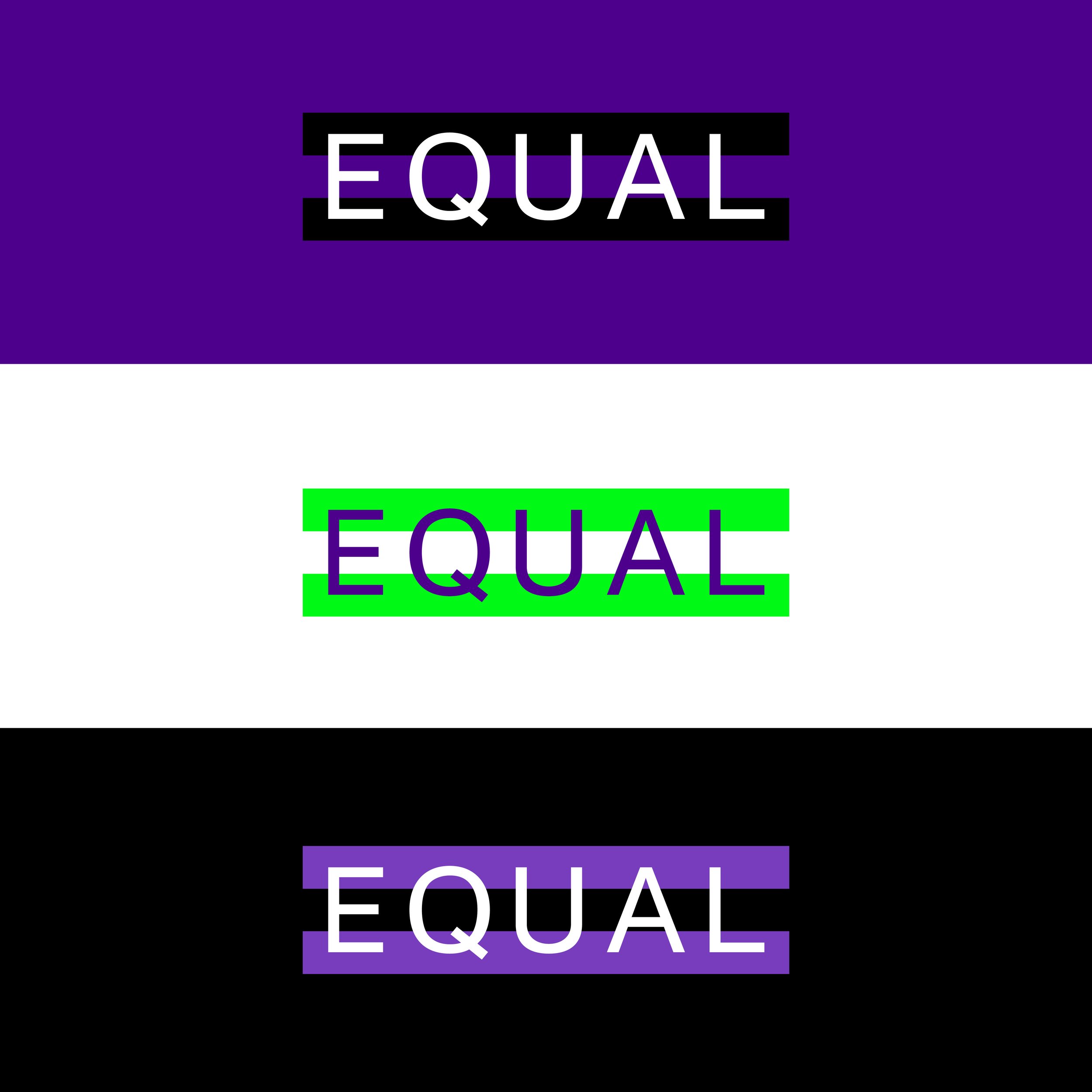
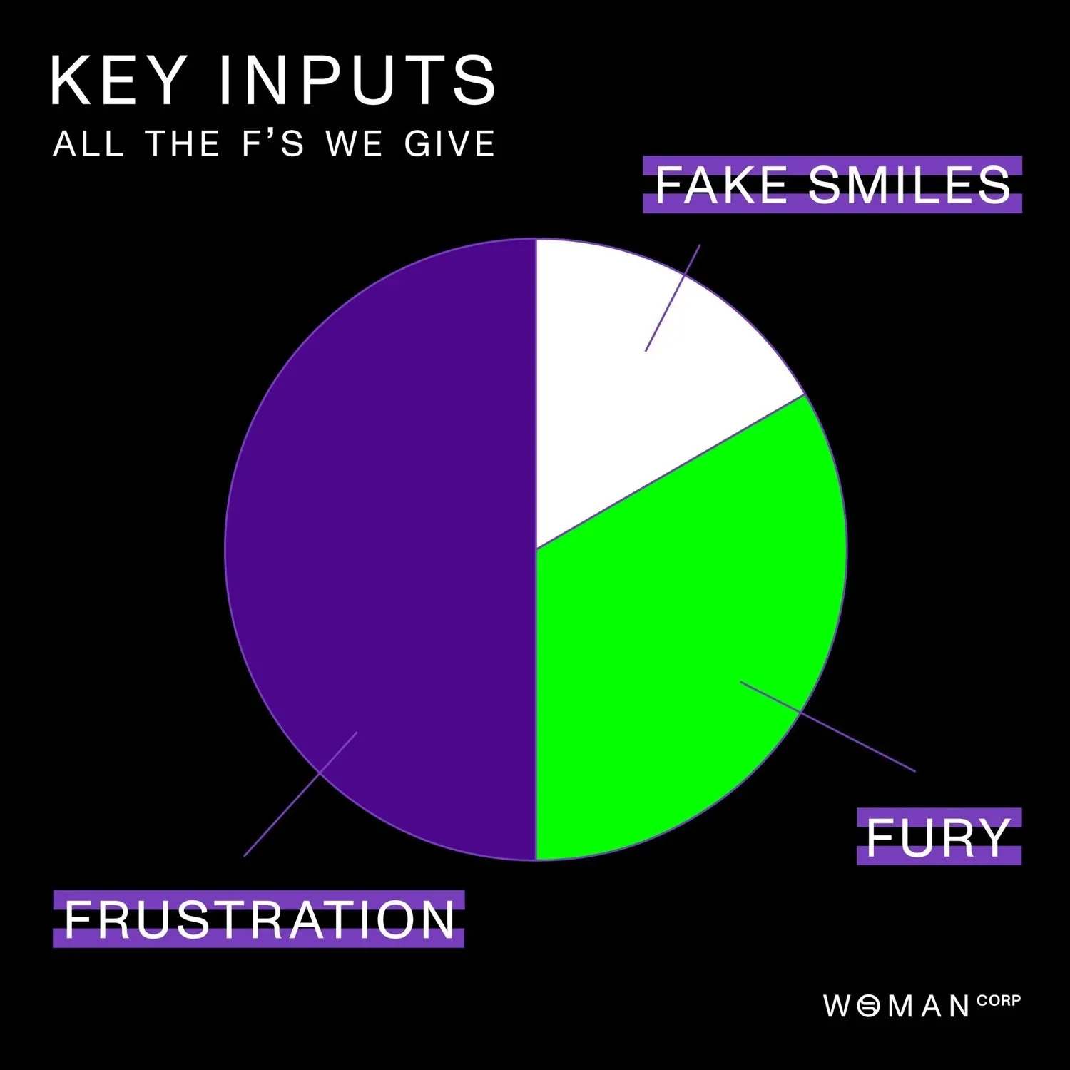
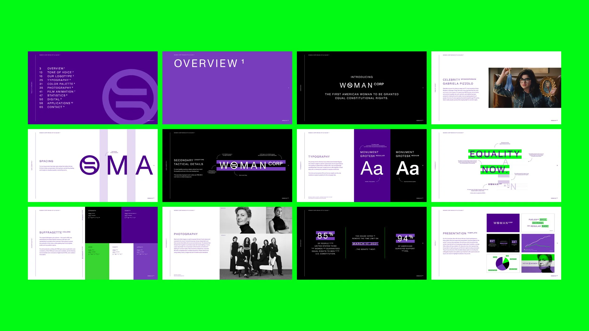
Inspired by the Suffragette visual identity (buttons, sashes, political statements, etc.) each color represents a principle of the movement — updated brighter, bolder and impossible to ignore.
Right now, the constitution gives more power to companies than it does to women. Let’s redistribute this power by placing CORP in superscript, using visual weight to help address society’s imbalance.
For too long women have been seen as less than before the law. It's time to take up equal space. We're going to use kerning, leading and margins to visualize equality in everything we do. Women have been fighting for Equal Rights for 100 years. We’re going to draw attention to the issue and highlight what’s at stake using a double color bars that represent an equal sign.
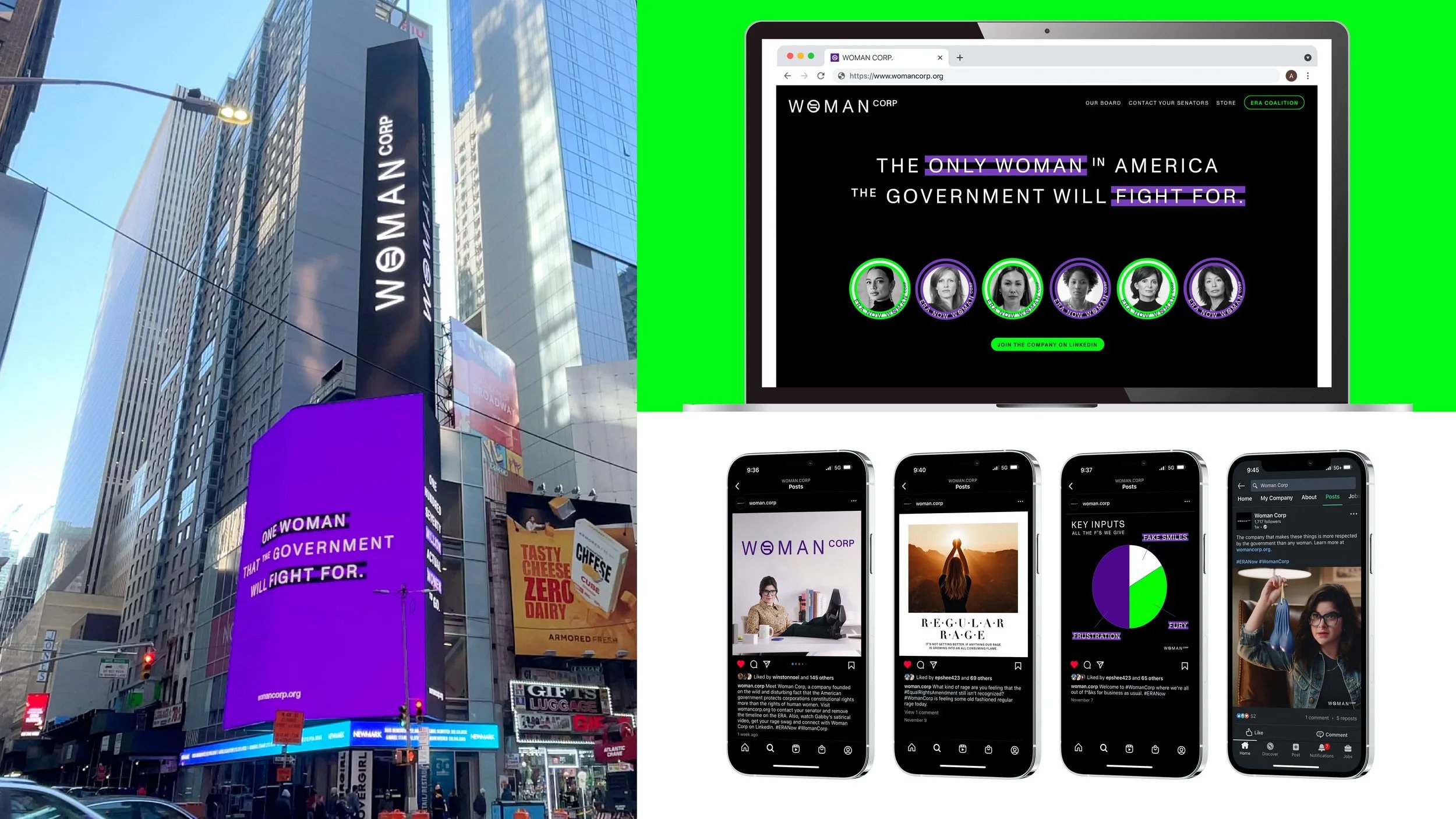
Watch Gabby’s satirical video below, get your rage swag and connect with Woman Corp on LinkedIn.
Award Submission Board & Case Study