CST_Thumb.jpg

Chicago Sun-Times

Chicago Sun-Times newspaper had the opportunity to become best-in-class under new ownership. Our Ogilvy design team was part of the process to improve the identity and product completely. A source that aimed to be trustworthy to a new generation of readers without alienating current readers. The “Gritty” aspect of the newspaper is hard-working, brutally honest, unflinchingly brave, 100% dependable, and the people’s champion. The logotype design is based on two important qualities: Civic Pride/Passion + Utility.

CST_Masthead.jpg
CST_ReadingPaper.jpg
CST_FrontCover_SingleMasthead.jpg
CST_CoverTile.jpg
CST_FontPairings.jpg

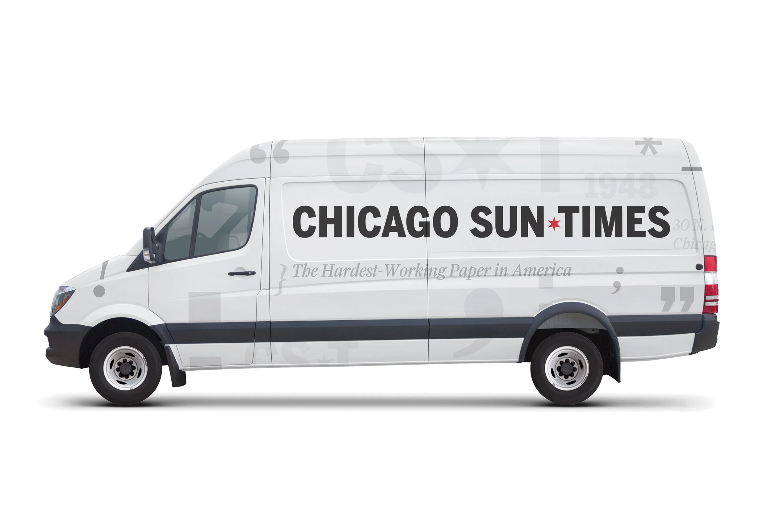
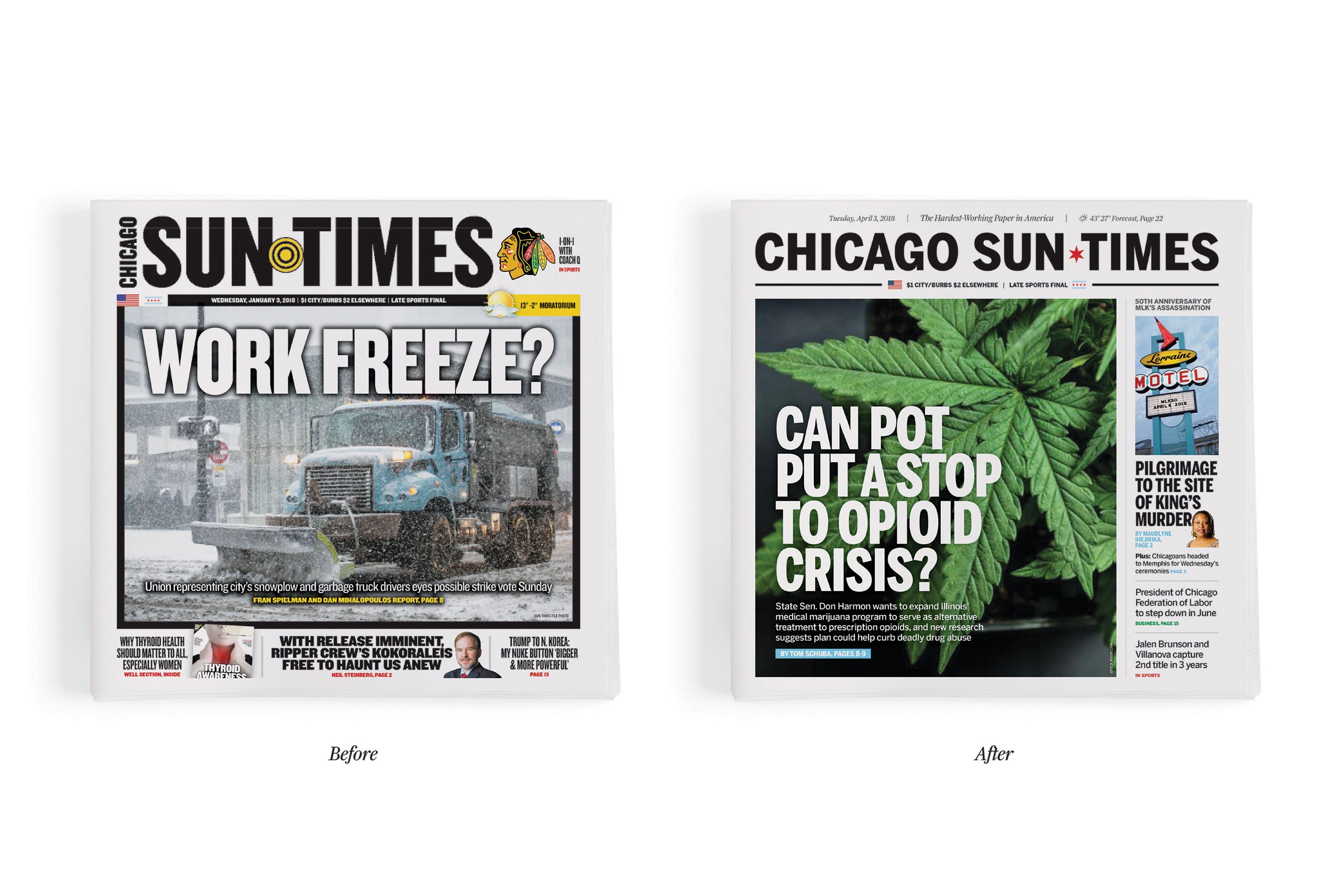
The utilitarian aspect of the logotype is represented by Benton Sans font, a modern rendition of a longtime favorite among newspapers, Franklin Gothic. Benton Sans scales easily, boasts a wide variety of weights, and pairs well with other faces, making it an extremely hard-working, flexible typeface for the Chicago Sun-Times. The pairing with Farnham is aesthetically proportioned due to similar letterform dynamic and energy which allows the two typefaces to work together well.

CST_Fonts.jpg
CST_pins.jpg
CST_Van.jpg
CST_BusinessCards.jpg
CST_Wildposting.jpg
CST_Cab.jpg
CST_Website.jpg

Client: Chicago Sun Times
Creative Directors: Gabe Usadel and Joe Sciarrotta
Design Team: Remy Glock, Lucia Vaughan and Sho Watanabe
Campaign Tagline Idea: Michael Franklin and Isaac Pagan
UX/Web Design: Mary Fran Wiley
Account: Kelsy Zemanski and Ray Marocco