

The Design Brief: What does Equality look like?
Inspired by the Suffragette visual identity (buttons, sashes, political statements, etc.) each color represents a principle of the movement — updated brighter, bolder and impossible to ignore.

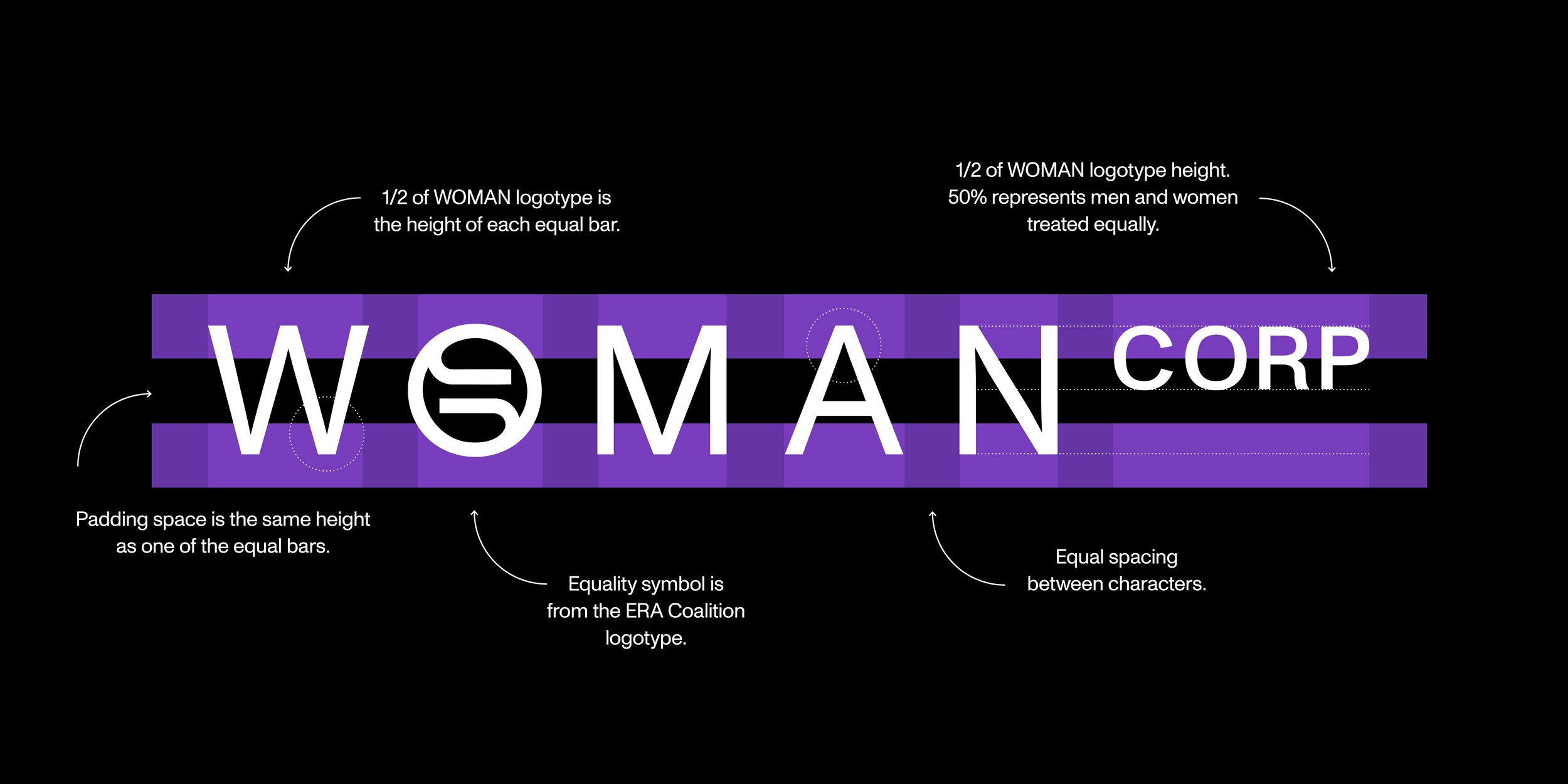
Right now, the constitution gives more power to companies than it does to women. Let’s redistribute this power by placing CORP in superscript, using visual weight to help address society’s imbalance.
For too long women have been seen as less than before the law. It's time to take up equal space. We're going to use kerning, leading and margins to visualize equality in everything we do. Women have been fighting for Equal Rights for 100 years. We’re going to draw attention to the issue and highlight what’s at stake using a double color bars that represent an equal sign.


Watch Gabby’s satirical video below, get your rage swag and connect with Woman Corp on LinkedIn.


Visit ERA Coalition Shop


CLIENT: ERA COALITION
CHIEF CREATIVE OFFICER: LISA BRIGHT
CREATIVE DIRECTORS: MEGHAN HOWELL AND WINSTON NOEL
DESIGNER: REMY GLOCK
ACCOUNT: ERIN SHEEHAN AND ELISE HORSAK
PRODUCER: SENG RIMPAKONE